Buttons
Buttons are used as triggers for actions. There are different types of buttons depending on the situation. This page will cover the different button types and situations.
Button Styles
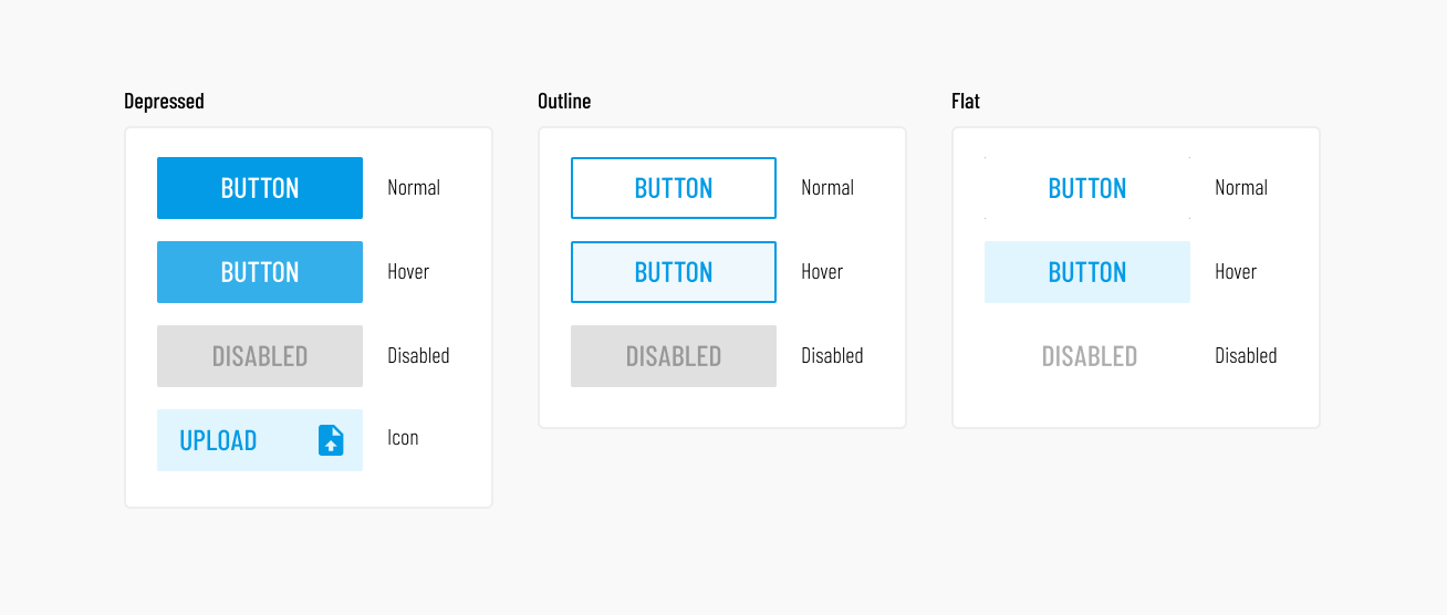
There are 3 main button styles:
- Depressed, the main button style. Used for actions that require
emphasis, such as buttons used for confirmations and other top-level actions
- Icon buttons are used sparingly to avoid visual clutter. Use this when you need to call a bit more attention to the button. The icon color will always match that of the font. The icon will usually be positioned on the right of the button.
- Outline, used for secondary actions that are needed within a larger workflow, where emphasis is not important.
- Flat, used alongside "Depressed" buttons. Depending on the color used, these can be used for actions secondary to the main action, or opposite actions such as "cancel".
See Vuetify's Button Documentation for more details.
Button sizes
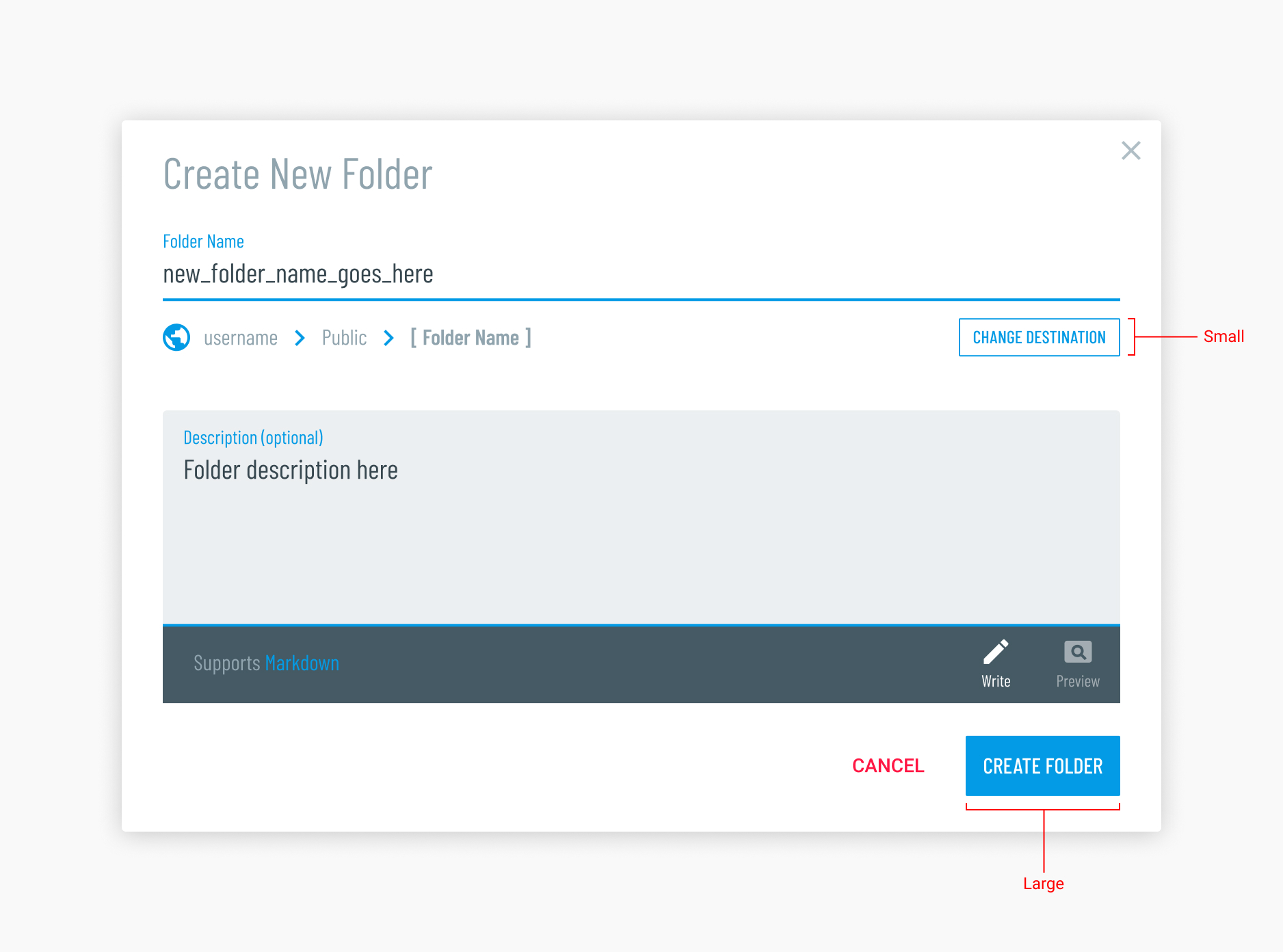
Vuetify comes with large, medium and small sized buttons. Here is how they are used for Girder.
- Large, used for the most important and top-level action buttons (e.g. the main upload button or any confirmative action buttons).
- Medium is not used at all.
- Small, used for secondary actions within a workflow.
Here is an example:
See Vuetify's Button Documentation for more details.
General Button Rules
Confirmation Buttons
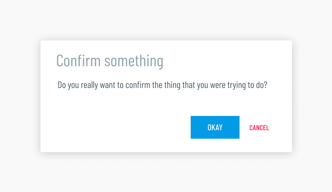
Buttons that represent confirmative actions should be thought of as the conclusion of a workflow. Therefore they should be the last thing displayed and should always be on the right.
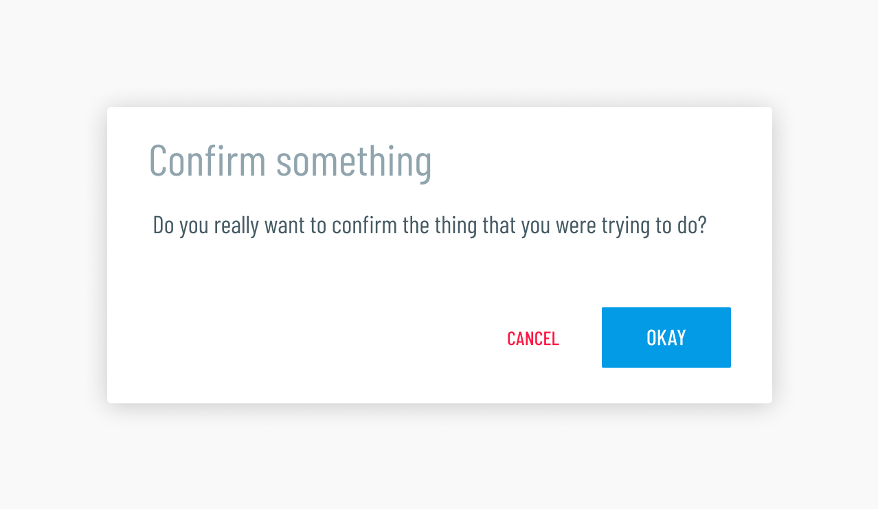
Do. The confirmative action button is given the most emphasis by
using the depressed button style (using light-blue darken-1). The
cancel button is close by to avoid having to move the mouse too far and is
de-emphasized by using the "flat" button style. The color red accent-3
is used to signify the button is a negative action.
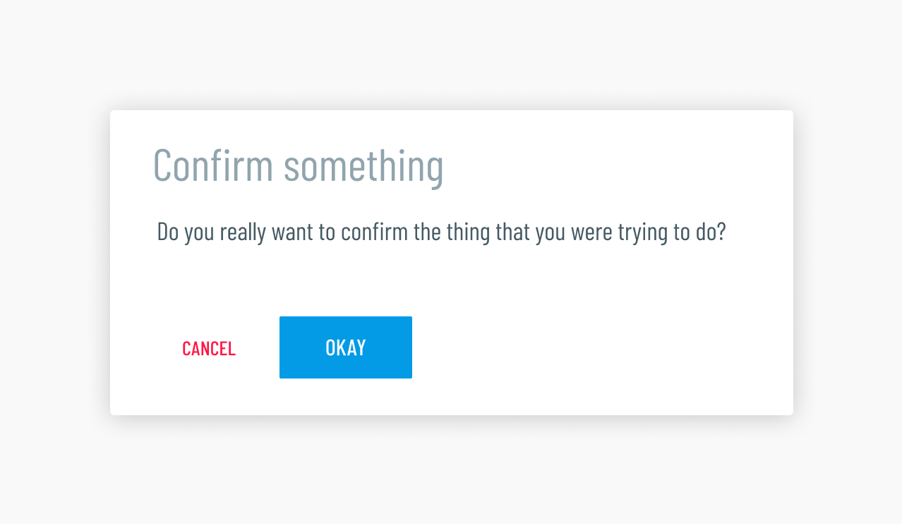
Don't. Even though the user would still understand the workflow displayed here, it is not best practice to display action buttons on the left side. Think of the action buttons as "next" buttons, since their job is to move you forward in the flow. Putting them on the right reinforces that forward movement.
Don't. Even though listing the main action button first supports the natural reading order, it is not best practice to display UI actions in this order. Placing the main action button last improves the flow because it assumes this button is the conclusion of said flow. The conclusion always comes last.

Don't. This seems like a completely reasonable way to display action buttons, right? The answer is yes, BUT even though there would be no confusion on the user's end, best practice is to keep the action buttons close to minimize mouse travel for the user.
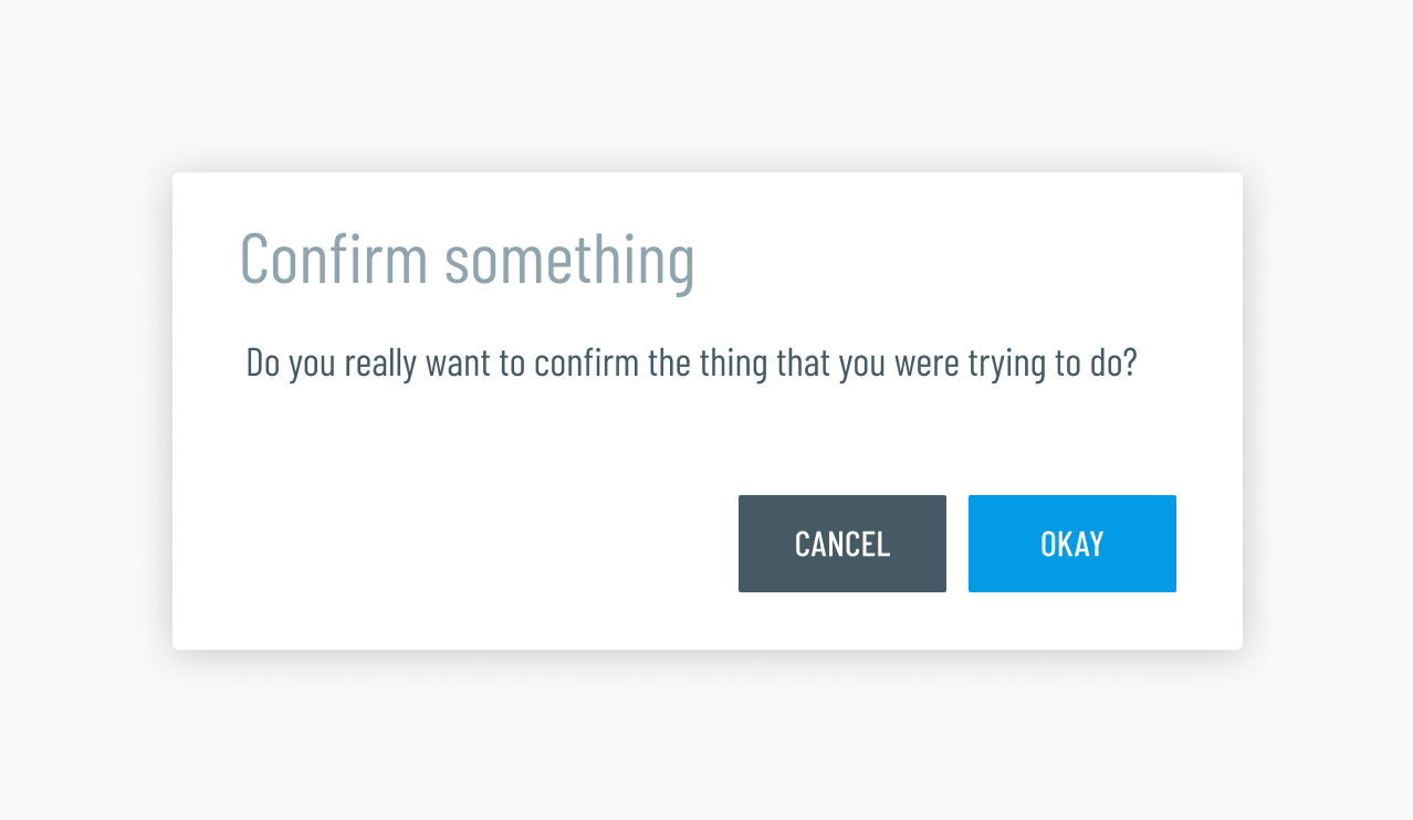
Don't. Negative action buttons should never have more or even similar emphasis to the confirmative action button.
Lists of actions
Sometimes you will need more than one or two buttons to represent actions. In this case you will use a line separated list instead of full color buttons to avoid clutter. Using icons here is a good idea, because it differentiates the action allowing for quicker identification.
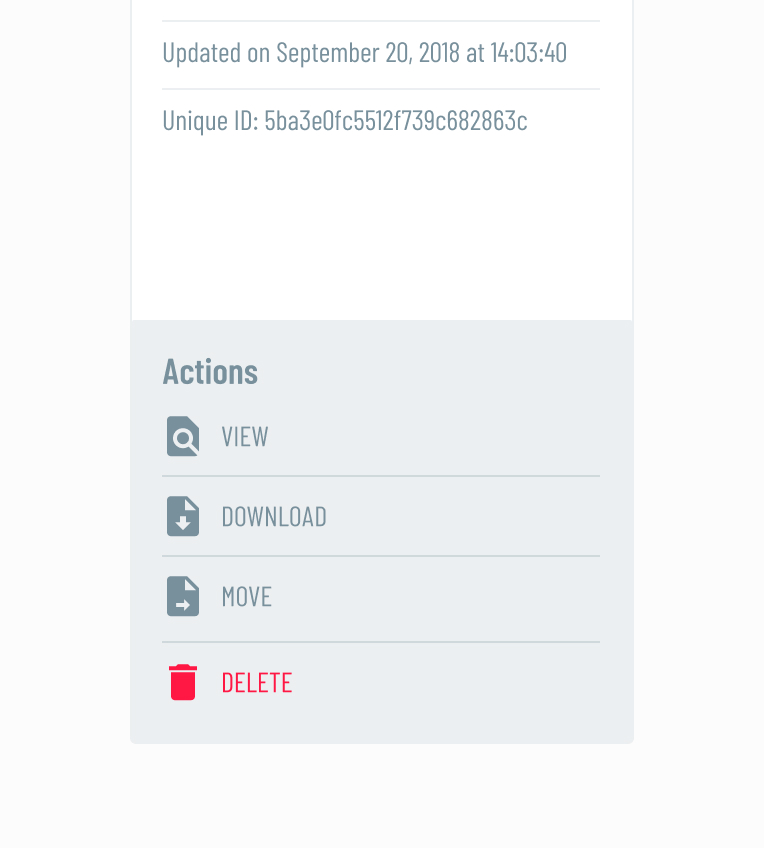
Do. A background color is used to separate the action buttons from the content above and icons are used to visually differentiate them. Notice "Delete" is displayed in red to to indicate it is a negative action.
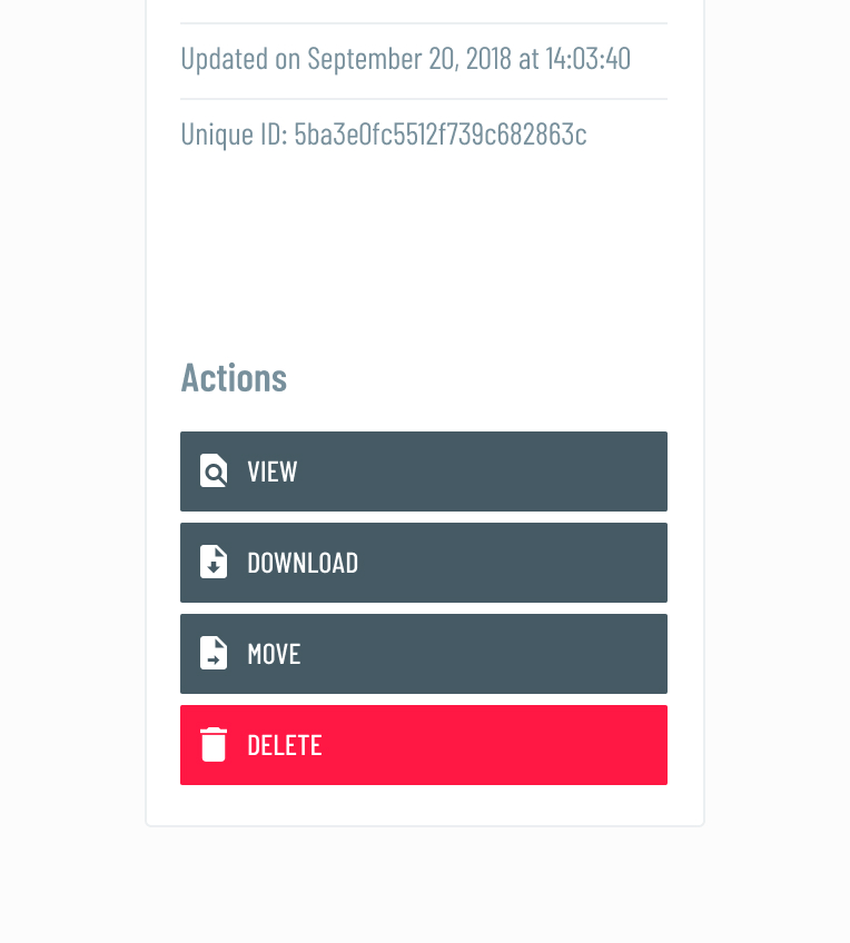
Don't. The use of full color background buttons makes this area more cluttered. The objective is to display it as a clean list than a group of larger, more emphasized buttons.
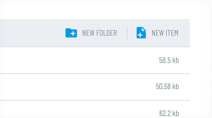
Do. You may also display the list of actions horizontally.