Alerts & Notifications
Users need to be aware of important information related to their actions. Alerts and notifications are our way of keeping them informed.
Alert Styles

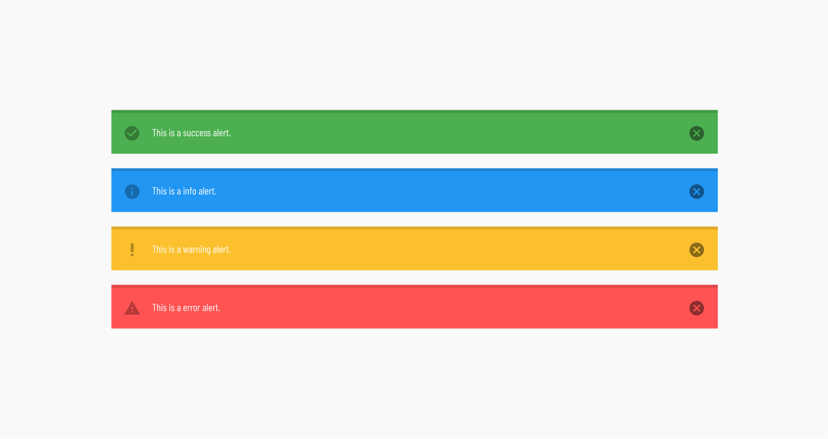
There are 4 types of alerts:
- Success - Typically only used for actions such as file uploads or folder creation.
- Info - Lorem ipsum dolor sit amet.
- Warning – Lorem ipsum dolor sit amet.
- Error – Used for things like failed login attempts, interrupted uploads, etc.
See Vuetify's Alerts Documentation for more details.
General Alert Rules
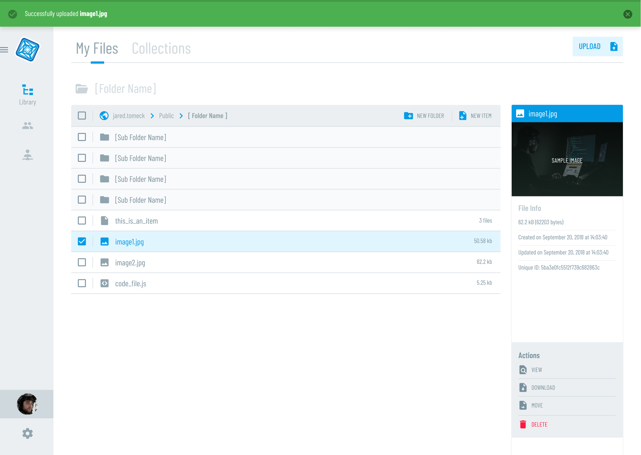
Alerts should always be displayed at the top of the screen, full width, with a slight shadow underneath. This creates one consistent place for the user to look to be aware of what is happening.

Do. Alert on top of page, pushing the rest of the content down below it. notice the slight shadow underneath to give it more emphasis. The upload workflow starts in a modal. When it succeeds, the modal disappears and the success alert is displayed for a short time, or until the user closes it.

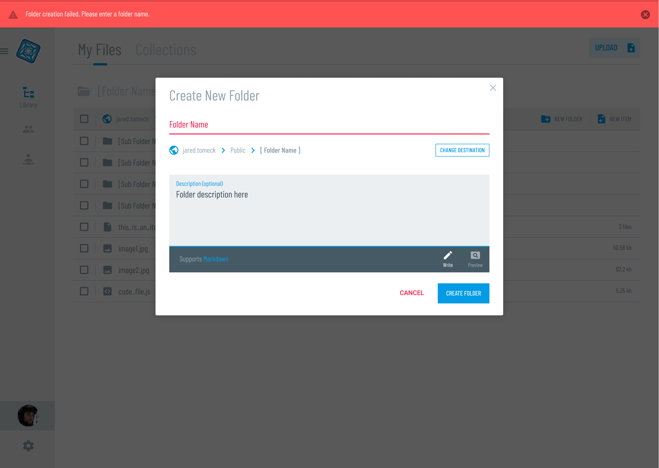
Do. Once again the alert is on the top of the page, however, in this case the modal does not close, due to there being errors within the form. If the modal were to close, the user would have to go through the process all over again. Notice the form field with the error is also colored in red so the user does not have to think about which field they need to fix.

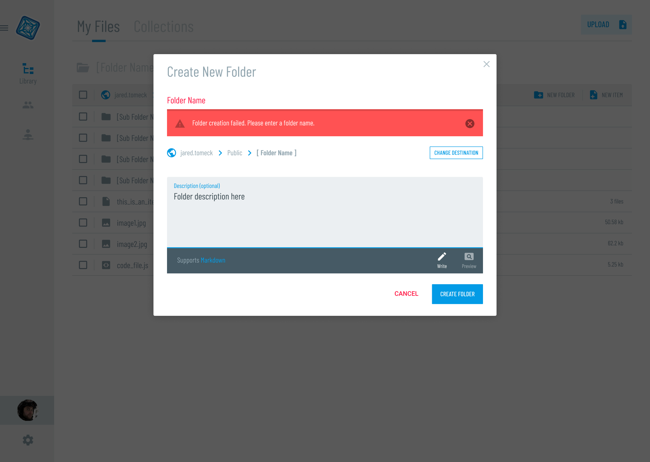
Don't. Although the alert is being displayed exactly where the problem is, it sort of clutters / obscures the field from the user.